A Magic: The Gathering Creature Review by Jonathan Wojcik
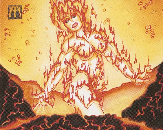
Illustrator: Melissa Benson
Say "elemental" around most fantasy geeks, and you'll usually call to their mind something like this Fire Elemental from Magic's early years, once subjected to far too many jokes on the word "hot." Elementals are traditionally entities made from pure rock, fire, water, air, or in more adventurous settings, things like mud or sand or mercury. Things literally made of just one pure substance or chemical reaction. A classic trope, but one that I personally always find a little dull and repetitive. I definitely prefer stranger monsters than just some guy made of silt, or something, and I'm glad Magic's elementals have grown increasingly peculiar...
The Belligerent Hatchling
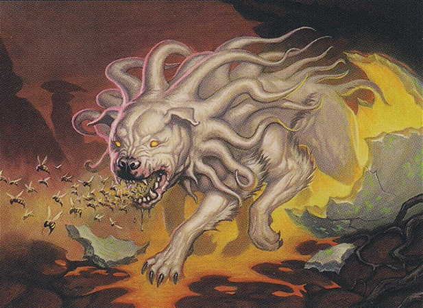
Illustrator: Dermot Power
...On the other hand, many are so out-there that there's really nothing in particular defining them as "elementals," other than Wizard's claim that they "embody the raw forces of nature." You know, like the raw force of a tentacle-dog with bees in its mouth, and when it barks, it shoots bees at you!
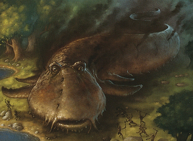
The Stenchskipper
Illustrator: Howard Lyon
Likewise, I don't know what a giant, hovering, smelly mudskipper would be an "elemental" of, but I'm still happy Magic has a giant, hovering, smelly mudskipper. A giant, hovering, smelly mudskipper apparently worshiped by boggarts. Many, and in fact most, of the elementals we'll be reviewing actually come from the complementary Lorwyn and Shadowmoor settings, which had heavy focus on pixies, tiny goblins and other traditional fairy-folk with cool new twists.
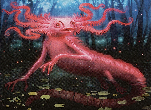
The Ethereal Whiskergill
Illustrator: Howard Lyon
From what I surmise, the idea of elementals, at least as of Lorwyn, is that they're essentially pure magical power manifesting into animal-like forms. Their overall design scheme is meant to be just a little more abstract and impossible than natural "beast" type creatures (which I'm sure I'll also review one day) but not quite as insane and ghastly as spirits or horrors. This floating, hot pink axolotl, looking almost as heart-meltingly adorable as a real axolotl, definitely feels more supernatural than just any other big salamander.
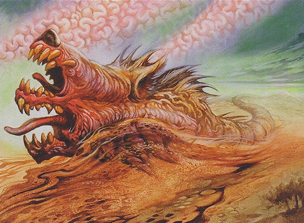
The Whimwader
Illustrator: Jeff Easley
This beautiful nightmare, on the other hand, feels a lot closer to horror territory, looking almost like a manifestation of John Carpenter's The Thing. Cutely, the concept was described to Jeff Easley as a two-faced "wolf eel," but he wasn't aware that wolf eels are actual animals. When he sent them back this disturbing, melted dog-face serpent, they understandably loved it anyway...and is that brain tissue blowing around in the sky? Is that part of the Whimwader? Does it generate...
...Brain storms?
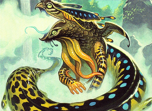
The Shriekmaw
Illustrator: Steve Prescott
Shriekmaw was a fairly popular design when it debuted, which I say because it's one of the very few Magic monsters to have inspired the kind of fan-art I can't show you here. It certainly is interestingly pretty for a black card, what with its butterfly-like flaps and mirrored frogmouth face on the body of a colorful tiger salamander. It's made entirely of parts from completely harmless, adorable little animals you would barely associate with doom and darkness, but put together in a way that's actually pretty freaky. I honestly approve of this black creature looking a little "prettier" than they usually do. After a while, even seething abominations can start blending together.
The Heartmender
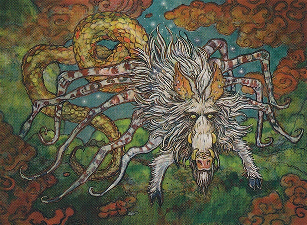
Illustrator: Rebecca Guay
Okay. Well. I don't know about the rest of you, but a warthog-spider-snake is certainly the kind of thing that would mend my heart.
The Doomgape
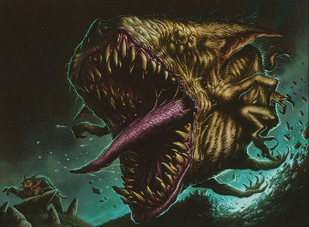
Illustrator: Dave Allsop
I enjoy the equal elements of monstrousness and whimsy, here; a hairy, eyeless, roundish beast that's 80% mouth doesn't sound like it would be this cute, but there's just something so silly about those little, flailing limbs. It's a titanic, slavering puppy dog mouth that just barrels and chomps its way through everything in its path! What's not to love? I mean, unless you're that sorry chump in the bottom left.
Hostility
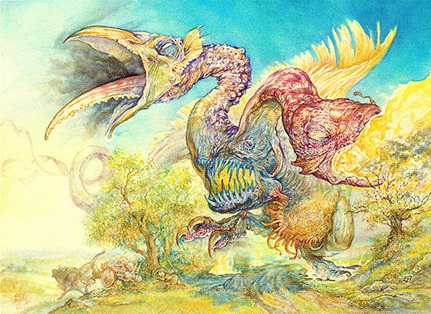
Illustrator: Omar Rayyan
The more I look at this one, the more I like. It's like a huge, scabby, dancing chicken, but with the heads of a baby vulture and some sort of catfish. The mouth in between the two is pretty neat as well, even if it hits almost uncomfortably, albeit accidentally, close to a concept I did long before this set came out. It certainly does look like an embodiment of hostility, in any case. What else would it look like?
Dread
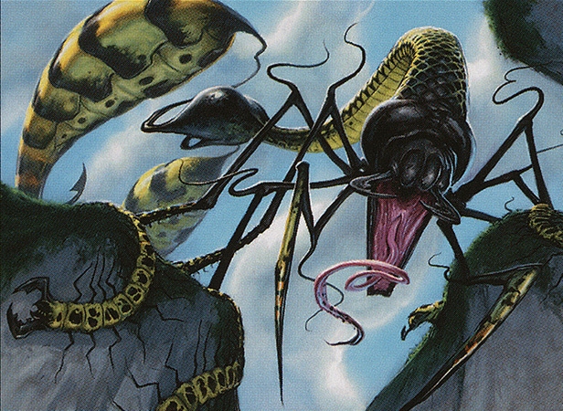
Illustrator: Matt Cavotta
This kick-ass hybrid of biting, stinging, venomous creatures almost doesn't look like a single, coherent creature, its dual hornet abdomens barely connected to its body by thin, stringy tendrils, and its last six legs apparently ending in long, winding feet resembling whole centipedes! It's so beautifully disorienting, a single body resembling a whole swarm of different creatures, that even I might find this thing slightly dreadful to encounter, though still not enough to kill my desire to keep it in a giant terrarium.
The Rust Elemental
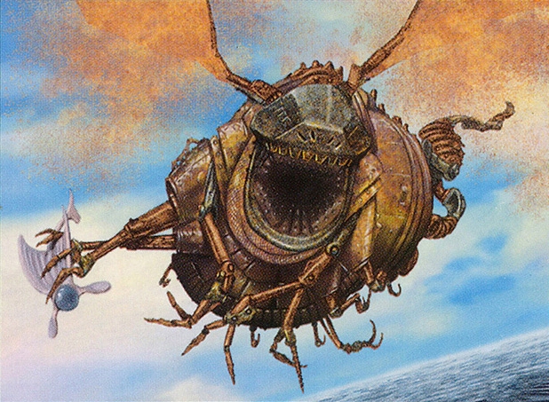
Illustrator: Arnie Swekel
An unusual artifact elemental, this definitely looks like the kind of thing that would physically symbolize the oxidization and corrosion of metal. Its fat, jolly Slimer-like proportions are just lovable, and the physically impossible wings of perpetually dissolving rustiness are a way cool touch. That poor little flying artifact-critter in its claws doesn't stand a chance.
The Dawnfluke
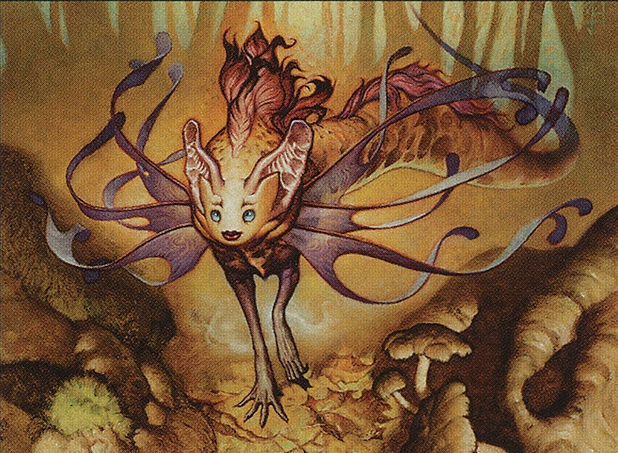
Illustrator: Mark Zug
This white elemental looks innocent enough at a glance, but might have one of the most unsettling faces of anything I've reviewed from the game up to this point. That perfect, smooth, noseless face, doll eyes and ruby-red lips are just so wrong, especially with its big, muscular mer-cheetah body and membranous bat-ears. The dainty, clawed forelimbs, directly between human arms and emu claws, nicely complete the effect. I'd be a lot more terrified to run into this than Dread. At least with Dread, you already have a good idea what it'll do to you. This just looks like it might bad touch you.
The Hateflayer
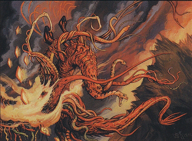
Illustrator: Thomas M. Baxa
Okay, this is definitely a design on the "spirit" side of things, but however you want to classify it, Hateflayer is almost comedically bad-ass. It already sounds like a Death Metal band, and could serve as its own album cover to boot. A burning, sparkling tangle of talons and barbed, branching snakes is pretty much the only thing I could ever imagine literally flaying hate. I don't even know what that would mean, but this is obviously the thing that does it. I wouldn't even ask questions. If you pointed to one of these screaming across the sky and said "that, sir, is a hateflayer," I'd just be all "yes. Yes that is quite apparent."
The Flickerwisp
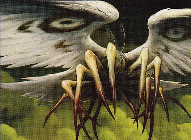
Illustrator: Jeremy Enecio
This feathered, moth-like creature with no apparent head and sixteen fleshy, spidery finger-legs is another of those rare, white creature cards we can truly describe as a monster, though an even more striking example is yet to come. When Flickerwisp enters play, it causes any other card you want to vanish for just the rest of the turn, its flavor text quipping that "its wings disturb more than air." I don't know what makes any of this "elemental" in theme, but apparently this thing flapping can send you bouncing into some totally random dimension out of infinite possibilities. Luckily, you come right back! You might not even go to one made of poop or lava or anything! I love when a white card is almost more terrifying than the average black card.
The Cinderbones

Illustrator: Carl Critchlow
Hearkening back to the more traditional definitions of "elemental" is an entire family of "cinder" beings, my favorite of which is this "Elemental Skeleton." I love the charred flesh, or who knows what, still clinging to its arms and legs, and that glowing hot face is damn haunting.
The Thicket Elemental
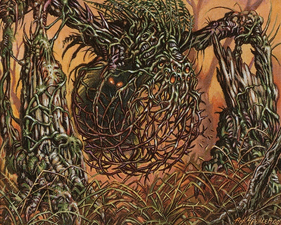
Illustrator: Ron Spencer
Ron Spencer always knows how to take a concept in a cool and alien direction; this two legged, spider-eyed stickerbush would be fairly interesting on its own, but the shadowy, hairy figure inside it is an ingenious touch. A prisoner of the thicket creature, or its true body?
The Supreme Exemplar

Illustrator: Mark Tedin
What. What in the world is going on here? A "Supreme Exemplar" is a city-sized manta ray with at least six different animal heads? Sure. Why not. This thing is both hilarious and terrifying, almost like something out of the Dictionairre Infernal or other classical monster art. Really, anything with both a goat's head and at least one other head is going to exude some creep factor. The rest are just bonus heads. Especially the toad. A toad head is like a double bonus. Supreme Exemplar's really gunning for the head-having high score!
The Tar Fiend
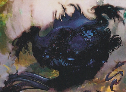
Illustrator: Anthony S. Waters
A little more down to Earth, the Tar Fiend makes the most sense out of every single thing on this page to be called an elemental, but still looks like a totally strange little alien monster. All creatures of ooze-like consistency have their charm, but that little pug-mouth slung under Tar Fiend's various eyes is so darling. You just couldn't possibly resist snuggling that silly, toothy little face, which is probably how Tar Fiend traps its prey. I also like how its "arms" remind me of broken chicken wings, unless that's just me. I see chicken parts in a lot of places. I live in a whole hidden chicken part world.
The Desecration Elemental
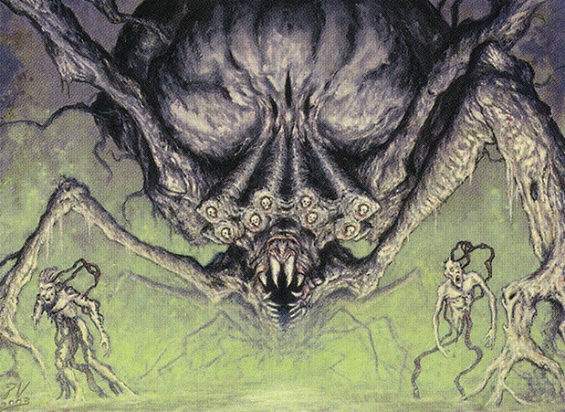
Illustrator: Pete Venters
Okay. If only one Elemental has a shot at kicking the Hateflayer from its throne of burning skulls in the Mountain of Rock, it would have to be an elemental of pure Desecration. Leave it to Pete Venters to know exactly what "Desecration" looks like when it gets up and walks around; a towering arachnoid cyst of blackened, gnarled wood, Vagina Dentata jaws and - look very, very closely - human skulls for EYES. The corpses (if they're even actually dead...yikes) animated by its roots are a great touch, leaving me to ponder whether this thing is even mobile at all or just sends its infectious tendrils worming their way through the surrounding land, turning everything they touch into its tainted minions!
The Spawnwrithe

Illustrator: Daarken
Strangely, I don't have much to say about this multi-headed maggot-snake's design, either, though I feel I must include it because it's one of the few cards with a parasitoid theme; if it successfully damages your opponent, it generates a duplicate of itself! Nasty! Considering that it does two damage by default and players start with twenty life, that means some poor sap could have ten of these rip out of their torso before their misery is over. That's so insultingly horrible, it's hysterical. Can you just imagine the increasingly mutilated, increasingly paranoid wizard visited over and over again by more freaking spawnwrithe? Tearing out of his flesh just to slither back to the enemy's side and do the whole thing over the next day? For God's sake, just conjure a gun already and end it all.
The Offalsnout
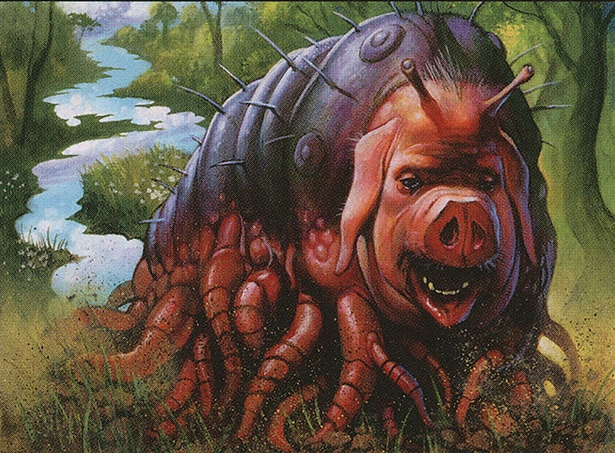
Illustrator: Alex Horley Orlandelli
Oh my word. This pig-slug-caterpillar with earthworm legs is just about one of the cutest, dopiest, most lovable black-mana monsters I have ever seen, though perhaps fairly disturbing, I suppose, in the usual manner of out-of-place pig faces. What would this be an elemental of? Decomposition? Definitely speaking my language.
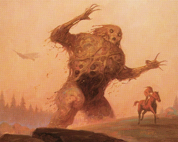
The Aboroth
Illustrator: Brom
I remember really liking the Aboroth when it debuted, and even using it in my main deck for a while. It's just a giant humanoid made out of dirt, but it has such a cool, haunting look to it courtesy a generally killer artist, and it has an interesting gimmick to it as well; it starts off fairly large, but gets exponentially smaller each turn, until it's gone in no time!
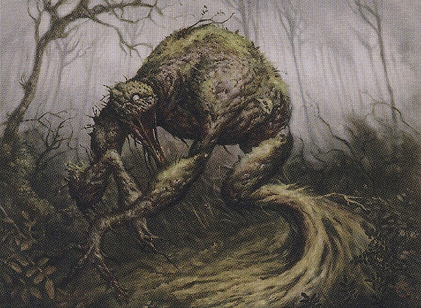
The Skullmulcher
Illustrator: Michael Ryan
I really love the look of this horrible green-mana elemental. One pale, pupil-less little eye, a toothless maw unnaturally stretched open, its whole body made of soil and moss with little twigs and leaves trapped in it.
Not too many skulls here, though. You're telling me it mulches skulls, enough to be named after the act, and there's only one partially visible in the whole illustration? It's right above the thigh, if you're wondering.
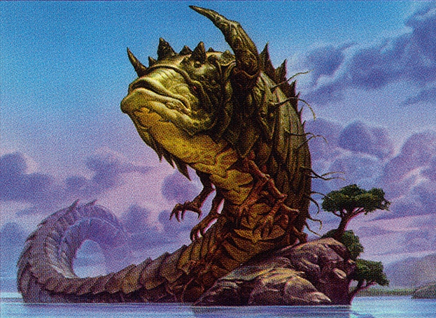
The Aethersnipe
Illustrator: Zoltan Boros and Gabor Szikszai
This looks exactly like something that would be painted by artists with names like those. A charming fish-faced worm with an isopod's exoskeleton, dozens of little chicken-clawed hands and writhing feelers down its sides. I'm not sure what it means to snipe aether, what kind of "element" that would be or how this embodies it, but I accept and support Aethersnipe unconditionally, because look at that face.
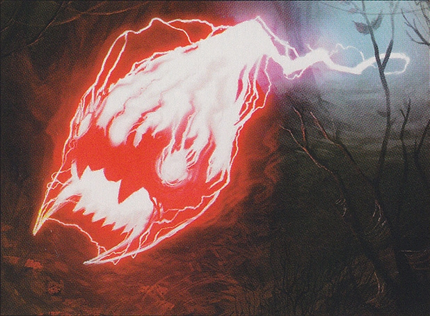
The Ball Lightning
Illustrator: Trevor Claxton
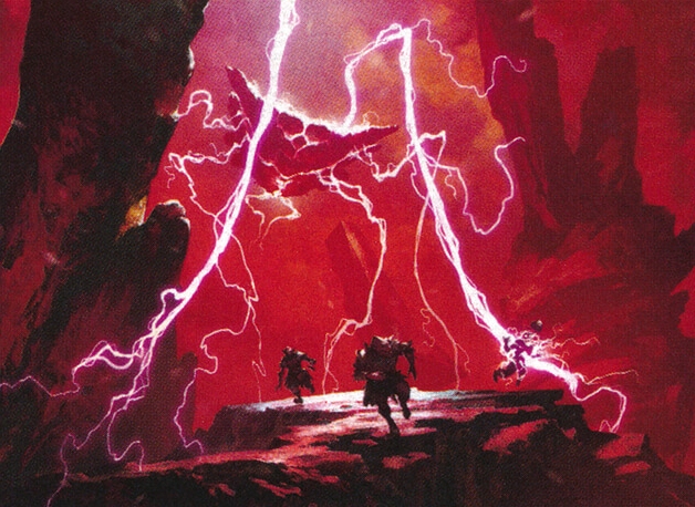
This is an interesting and actually classic magic card; for three red mana it has a whole six attack, and only one toughness (health), can attack the turn it comes into play and can trample over smaller creatures...but it also dies at the end of its first turn. It's both creature and one-off spell.
Originally, all this was meant to convey actual, literally ball lightning, a natural phenomenon rather than an actual creature, but in 2010, it was repainted by Trevor Claxton as this crackling, alien energy-face, which is definitely more fun, even if the idea of a creature card for lightning was fairly novel in its own way.
The Celestial Ancient
Illustrator: Mark Tedin
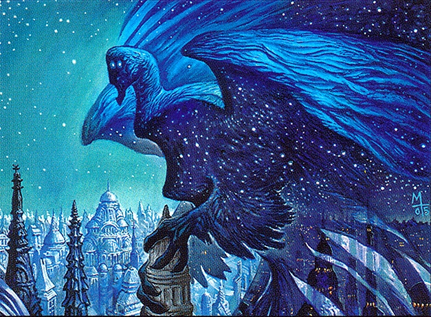
A VERY cool white-mana creature. I love the simple aesthetic of this galaxy-colored bird with a decidedly non-bird head and eerie little "stars" for eyes. I think it's supposed to have four eyes and we're just looking at it in profile, but my mind wants to read that as the front of its face with just two goofy little close-set peepers and I honestly like that a little bit better. Either way it's pretty awesome, though.
You would expect this to be a HUUUUGE monster, but it's only 3/3.
The Cloudthresher
Illustrator: Christopher Moeller
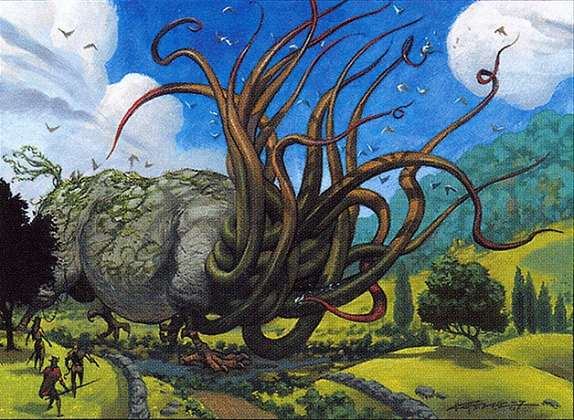
I like how this is just a giant rhinoceros with absurd bird feet and a ton of giant tentacles instead of a face. It's also funny just how much it apparently hates birds. It can not only block flying creatures, but as soon as it comes into play, every player and every flying creature sustains two points of damage right off the bat.
The Creeper Hulk
Illustrator: Ralph Horsley
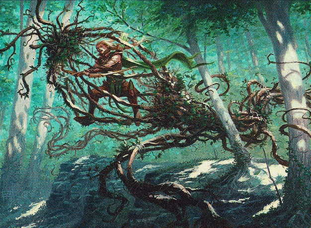
This green elemental is 5/5, has the "trample" ability, and allows you to spend two mana to make any other creature a 5/5 trampler until the end of the same turn, apparently because this mobile tangle of vines works like a sort of living vehicle, or a really really weird "mount." I love this concept, and I love how it's shaped like some kind of wacky, walking jellyfish.
The Embodiment of Spring
Illustrator: Wayne Reynolds
This is a much more traditional kind of "elemental" being than the many hybrid weirdos on this page, but it's still a pretty creative one. I love the image of this hulking, icy figure whose "melted away" head has given way to greenery. Appropriately, this is a blue-mana card, but you can pay a green mana plus one mana of any other color to sacrifice it and search your deck for any type of land.
The Faultgrinder
Illustrator: Anthony S Waters
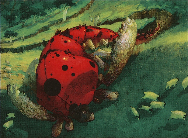
A 4/4 red-mana elemental, with trample, that also destroys any land card of your choice when it enters play, so I guess it really tears up the countryside, grinding all those faults. It also looks like an adorable combination of centipede, ladybug and turtle, which again doesn't read as an "elemental" to me exactly, but okay.
The Floodchaser
Illustrator: Eric Fortune
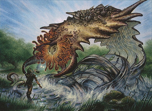
This might be one of the coolest sea monsters I have ever seen. It's a gigantic flatworm coalescing out of the water itself, its little multi-eyed face is surrounded by a regal mane of anemone tentacles, it has a lure like an anglerfish, and its back is encrusted with shells to evoke the very ocean floor itself. It's gorgeous!
br>It has some interestingly weird mechanics, too. It's naturally 0/0, but enters play with six +1/+1 counters on it. It can only attack if the opponent controls an island, but you can remove one of its +1/+1 counters to transform any land into an island for one turn, forcing it to become a little smaller every time it wants to attack a player who isn't using blue mana.
The Frostwalker
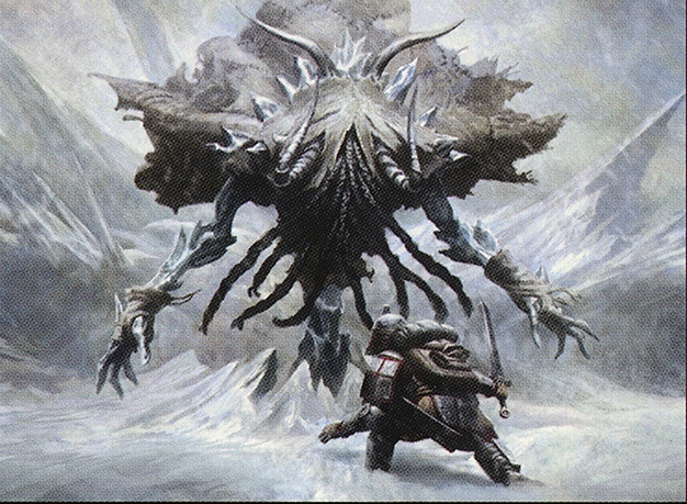
Illustrator: Mike Bierek This blue-mana elemental is downright terrifying! Look at it! A jagged humanoid of icy shards with both horns and oral tentacles, with most of its face hidden by a ragged cloak of sewn-together skins! The thought of a being like this roaming a frozen landscape is magnificently nightmarish, though in reality, the Frostwalker is a total pushover!
This is a 4/1 creature for two mana. That's very, very cheap for that much attack power, but of course it has the bare minimum of health points. It also has the added weakness of dying if it's ever targeted by any spell or ability, even a beneficial one, so as frightening as the Frostwalker may be, it can crumble to so much as a saproling.
The Plumeveil
Illustrator: Nils Hamm
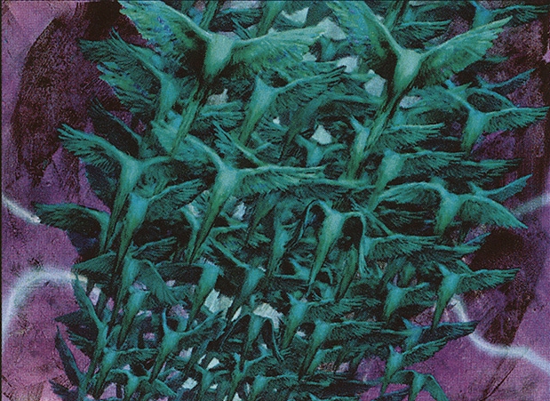
This is a card you can cast with any mix of either blue or white mana. It's 4/4 and can't attack, but it can defend you, it can fly, and it can be played at any time - even in the middle of your opponent's turn, if need be.
It's also nothing but a flock of headless birds, but, I really like that. It's a suitably surreal form for an elemental to take, especially one combining blue and white magic. The color of dreams, manipulation, wind and water plus the color of protection, order, health and light. Headless birds! Of course!
The Stingmoggie
Illustrator: Omar Rayyan
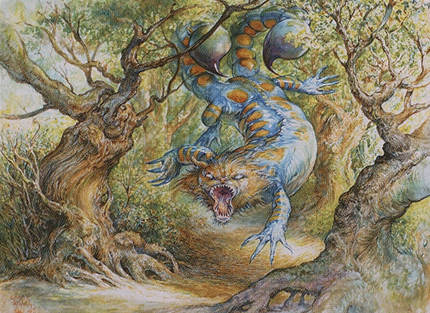
A red mana elemental, which can expend its power and toughness to destroy enemy lands or artifacts, apparently because it'll just stake out a territory or something and nobody ever wants to mess with it. I love the look of this psychedelic Cheshire Cat salamander with oversized scorpion stingers. It is definitely exactly what I would expect from something called a "Stingmoggie."
Did you know a "moggie" is a CAT? At least in British slang. What an incredibly un-catlike term for a cat. Where the heck did that come from.
The War Elemental
Illustrator: Anthony S Waters
It starts out only 1/1, but every single time any opponent is dealt damage, it gains a +1/+1 counter for every single point of that damage, permanently growing and growing with every battle it so much as witnesses!
It's also an incredibly cool image, a beast formed entirely from weapons, armor, and ironic flags of truce, arranged in such a way that at first glance, you think you're just actually looking at a small armor of armored warriors.
The Smog Elemental
Illustrator: Yeong Hao Han
Obviously a favorite of mine. Could have been weirder looking, sure, but I always love a pollution-based creature, and this seems strongly like an homage to the stingray-like flying form of Hedorah from Godzilla vs. the Smog Monster. In this case, however, we seem to have a larger smog bank with a denser "hammerhead," almost like a flatworm, with cool crackling electricity for "eyes!"
The Skizzik
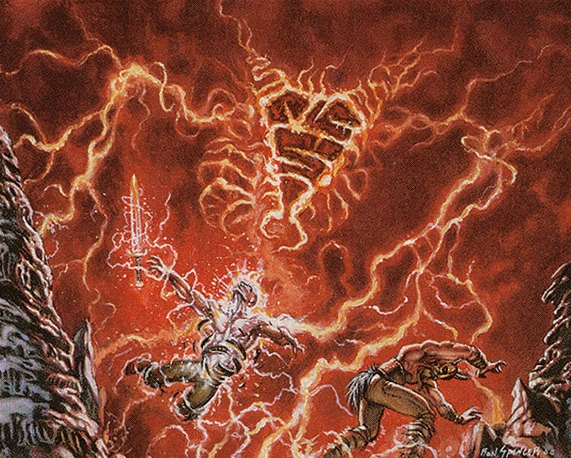
Illustrator: Ron Spencer
What a cool, cool thing! It's entirely formed from burning, crackling veins of energy, but forming an almost insect-like head with two large "arms" or "legs." I really like the angular patterns on that head, too, giving it an even more unnatural appearance, like some kind of big, floating, living magical "rune" in itself!
Skizzik is kind of an homage to the Ball Lightning card, in this case 5/3 for four mana with the same trample and haste abilities, though unlike the ball lightning, you can pay an extra red mana when it enters play so that it doesn't die by the next turn.
Years later, the Skizzik was reprinted with new artwork by Tomasz Jedruszek, and while the design is rather different, it's still a fascinating and frightening entity, now even more ominous with its looming, faceless carapace, and the lightning bolts now look even more explicitly like limbs!
The Noxious Hatchling
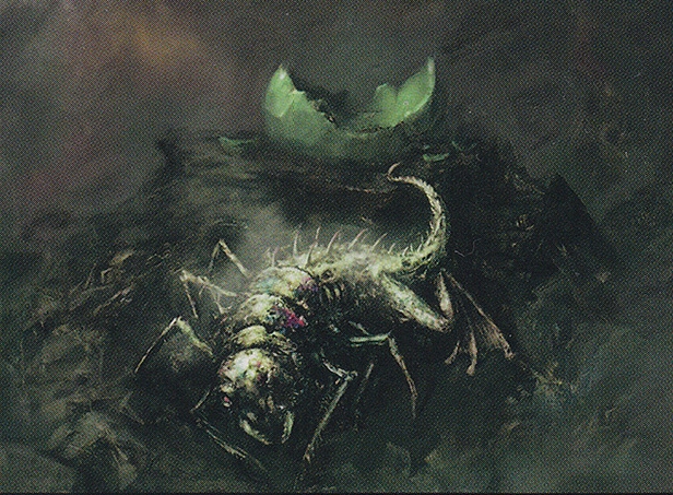
Illustrator: Nils Hamm
This precious baby costs only four mana for a 6/6 beast, but it comes into play with four -1/-1 counters, so it's initially a 2/2, but you get to remove one of those counters every time you play any other black or green spell, and as a bonus, it also dals damage to other creatures in the form of more -1/-1 counters, permanently weakening those it doesn't kill outright.
A "noxious hatchling" could have looked like any number of things, but I like what Hamm went with, with the spiny lizard tail, comical frog legs and hellgrammite-like anterior.
The Festercreep
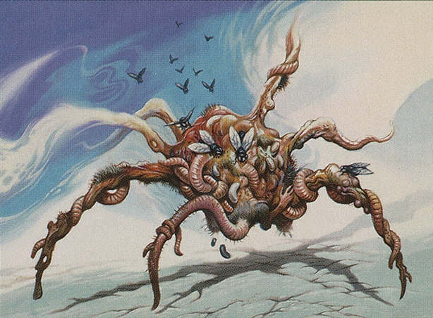
Illustrator: Jeff Easley
I LOVE the Festercreep. Spider-shaped from a distance, but made of worms, maggots, flies, moldy rotten flesh and at least one literal rat's ass, its tail serving as one of the conglomerate's legs! This...this brings a tear to my eye. It really does. If I were a nefarious sorceror myself, I think I'd be happy with nothing but Festercreep minions. Thousands of them...and still never enough. There could never be enough.
The Woeleecher
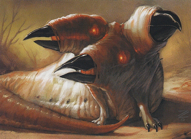
Illustrator: Izzy
Now, as much personal bias as I have for our last two, I feel that Woeleecher is the overall coolest design for an Elemental yet, and deserves most of all to be the one we end on. Another refreshingly monstrous white card, its multiple heads are clearly inspired by the appearance of a squid's beak, but the red-orange glow of its eyes, grown over with skin, illuminates its elongated toucan-like skulls. Perfection. A truly haunting image and not a monster you would expect to be a healer, though as its name implies, it'll apparently suck your woes - or magical curses - right out of your body. What a sweetie.
Sweeties?
