Secret Origins of Awful Hospital: Part IV: Awful Hospital's Earliest Concept Art
It's Awful Hospital's third birthday this week, so we're going to look at some "behind the scenes" materials, including some content previously exclusive to my patreon!
For this last origin page, we're just going to look at a bunch of different Awful Hospital stuff.
For this last origin page, we're just going to look at a bunch of different Awful Hospital stuff.
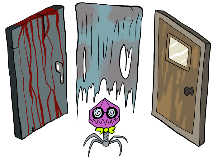
The same year as burgrr was also the year I hashed together Don't Get spooked!, and wound up slipping doctor phage in at the last minute. Even then, I was positive I'd be doing something bigger with him and his hospital, but I still wasn't sure what. I considered another twine game along the lines of Spooked or even another ARG website along the lines of Burgrr, but I'd already done those things. It didn't feel as exciting.
At the time, my webcomic - the same one Phage made his most formal debut - had been retired for quite a while, but I still had the urge to make something sort of comic-like, and wound up drawing most of my inspiration from drawn adventures like Rubyquest.
I started planning concepts out as early as spring 2014, and the following are all sketch pages produced around that time:
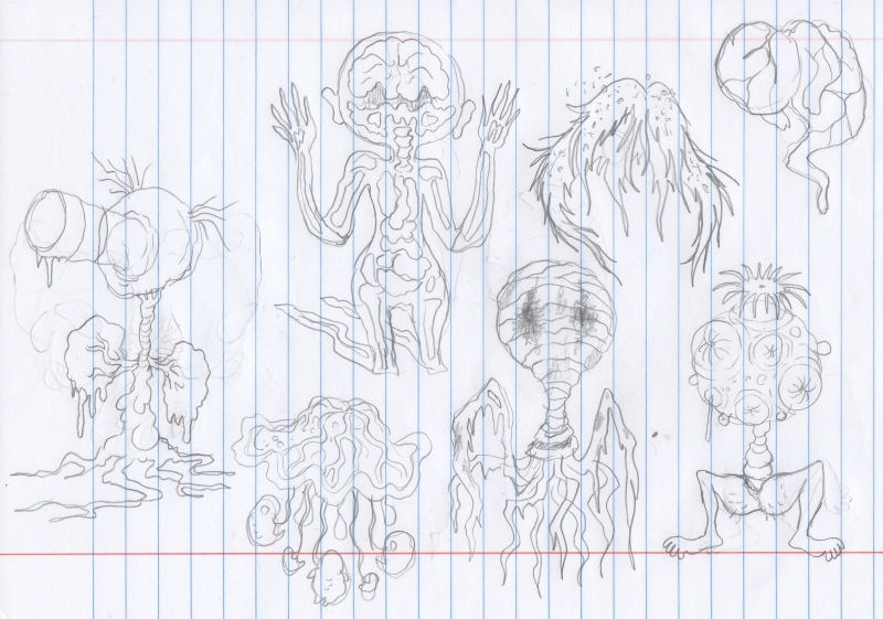
"Monsters," unsurprisingly, were the first things on my mind. I wasn't sure how to incorporate battles at the time (and some people still don't really like them) but with so many scary hospitals in so many horror movies, horror games and horror stories, I wanted to turn the general idea of a creepy hospital into a whole world of its own, populated by beings which naturally "evolved" to be a part of that motif. A couple of these monsters come straight from Don't Get Spooked, while others have evolved into completely different ideas. I still like the flapping wig, which is of course infested with lice.
For a while, I actually thought that all the "patients" in the hospital would be ghost-like creatures made out of stained bandages, basically a whole "race" of beings who only exist to be medical patients, and it was hard to choose between that and the mix of wacky body-organ patients we've got instead. Judging by feedback, I made the way more popular choice, but I still have a really soft spot for the idea of little ghost-mummy "patient people," and maybe we'll still find a place for them one of these days....though the Hospital's getting pretty crowded by now, isn't it?
For a while, I actually thought that all the "patients" in the hospital would be ghost-like creatures made out of stained bandages, basically a whole "race" of beings who only exist to be medical patients, and it was hard to choose between that and the mix of wacky body-organ patients we've got instead. Judging by feedback, I made the way more popular choice, but I still have a really soft spot for the idea of little ghost-mummy "patient people," and maybe we'll still find a place for them one of these days....though the Hospital's getting pretty crowded by now, isn't it?
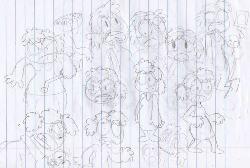
Here are the first drawings of Fern, who didn't even have a name at the time. I just thought of her as "the patient," and she was going to be one of those silent video game style protagonists with no defined personality of her own. I'm still not sure if or when she's going to stop appearing neon green; it wasn't just symbolic of something horribly awry with her place in reality, like a broken television image, but admittedly just made her really easy to keep drawing and coloring in a matter of a few seconds.
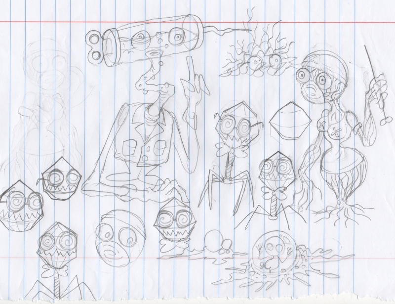
Here are some early sketches of the medical staff. Originally, the hospital nurses, rather than our head of surgery, would have been shapeless vein creatures who squeeze themselves into what are obviously cheap "sexy nurse" Halloween costumes rather than correct, professional nurse uniforms. I still think that's a funny idea, tying in with the Hospital as a broken reflection of our collective idea of a hospital, but it's also kind of dumb even for me. The image of a humanoid vein creature was also so ominous and surreal that it really needed to be a higher-ranking entity in the hospital "pantheon," or whatever you want to call it.
You can also see how doctor Mizer was still a somewhat smaller figure with a bigger head, evolving from the nameless syringe-headed designs you've seen on previous pages. He just kept bulking up every time he was drawn, until he was basically a Pyramid Head or Nemesis of the setting, big and silent and threatening, though in this case, "Pyramid Head" is completely well-meaning; it's just that we're part of the problem that needs to be fixed.
You can also see how doctor Mizer was still a somewhat smaller figure with a bigger head, evolving from the nameless syringe-headed designs you've seen on previous pages. He just kept bulking up every time he was drawn, until he was basically a Pyramid Head or Nemesis of the setting, big and silent and threatening, though in this case, "Pyramid Head" is completely well-meaning; it's just that we're part of the problem that needs to be fixed.
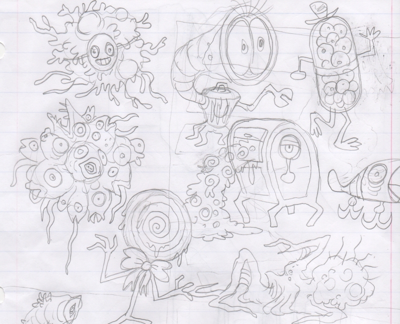
I also knew I'd want to be bringing other "zones" into play besides only the Hospital, and implying early on that something about their general makeup was beginning to break down. I actually planned for your own hospital room to have a secret hole in the wall you could step through to an only slightly different room with another hole to another room, and so on and so forth, and if you guys had demanded we keep going, we would have run into increasingly nonsensical monsters like these guys.
By now, this idea has morphed into the whole "Plank Maze," which is going to keep growing more important to the story.
By now, this idea has morphed into the whole "Plank Maze," which is going to keep growing more important to the story.
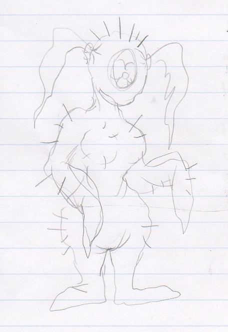
This was the first-ever Molly.
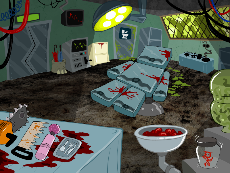
Now, for some art that made it all the way to color before it was scrapped! At one time, the entire surgical ward was going to be this one big room, with absolutely none of the story and characters it wound up encompassing. No, those are not very professional surgical tools at all, are they? But...there's Willis! He was planned as a helper to "the patient" from day one, but we originally would have had to rescue him before the surgeons literally threw him away as biological waste! This was before I decided he'd have any relation to Tori, don't worry.
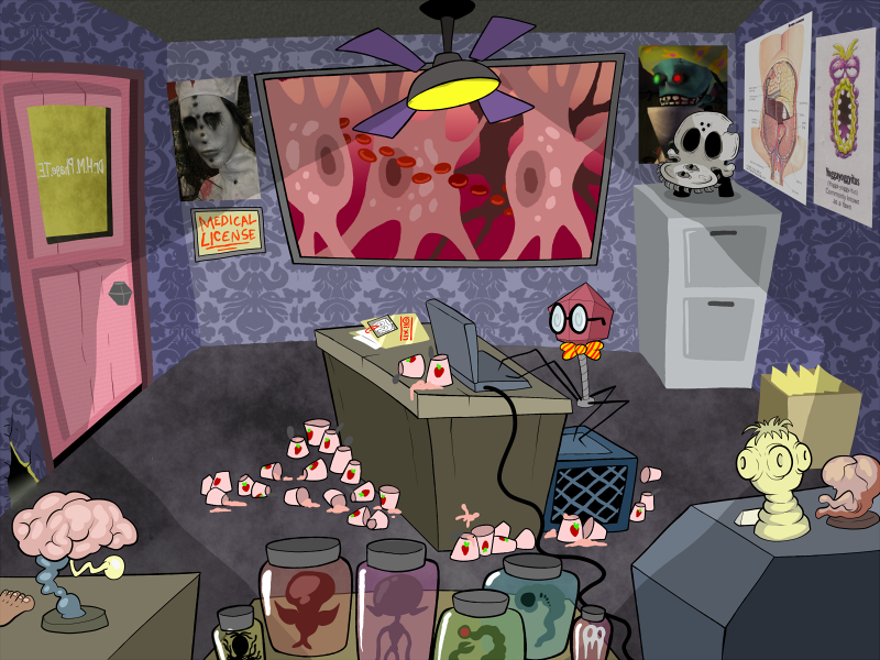
Here's another scrapped idea, for Phage's own office. Lots of easter eggs and visual gags in here, but I soon felt this was all still too normal and underwhelming to be this guy's room. The only ideas still "canon" here are the milk crate he stands on while he works and all the yogurt he consumes.
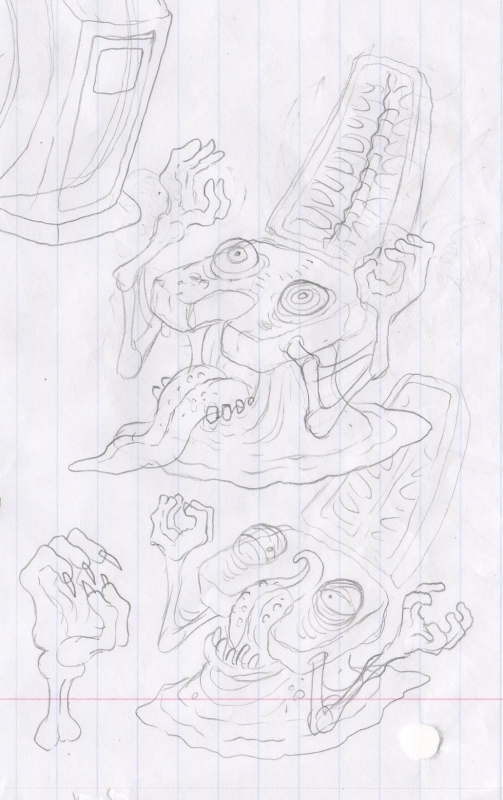
Finally, as your reward for being so patient and still liking Awful Hospital, here's a sketch for a piece of Hospital equipment so gross that it was ultimately turned into a toilet to make it less horrible:
Finally, as your reward for being so patient and still liking Awful Hospital, here's a sketch for a piece of Hospital equipment so gross that it was ultimately turned into a toilet to make it less horrible:
