GALARIAN YAMASK
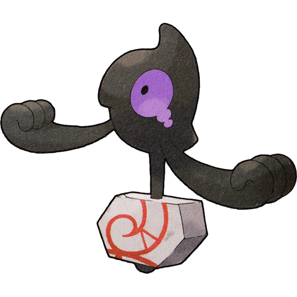
Yamask, now, is it? Well, I love Yamask, but, this doesn't do anything with its design other than make it ghost/ground type and swap out its iconic, eerie golden mask for a little broken chunk of runestone. While I understand the idea of it, it's just a major aesthetic downgrade. The stone could have at least been a piece with an eye marking on it, that'd at least have a little more pizzaz going on.

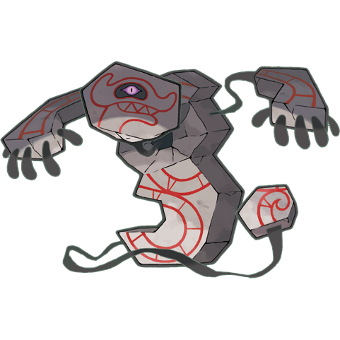
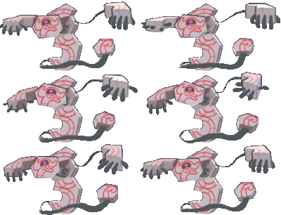
Okay...how do you pronounce "Runerigus?" Rune-riggus or Runer-iggus? Both feel clunky, and frankly, so does the design to me. I really WANT to like it, it has a neat principle behind it, I like it having just one visible eye and I like how wildly different it is from Cofagrigus, but...I just don't care for the washed out look of the dull red lines on grey stone, I don't think the "head" looks so good extending towards the viewer, and I don't think the little chunk of "tail" feels quite right either.
The Shield version Pokedex is cool at least; "Never touch its shadowlike body, or you'll be shown the horrific memories behind the picture carved into it." That kind of implies that the serpent drawing on it may have been an actual and incredibly destructive pokemon.
To be honest, I might like this design a whole lot more without the gimmick of the stone breaking apart. Just the stone with Cofagrigus-style limbs and that one eye would have really been enough for me, maybe breaking apart into chunks just for its attack animations.
It certainly is VERY cool that the stone tablet is basically a distinct Pokemon of its own that has more or less enslaved, parasitized and absorbed what used to be a human soul. It's like the Parasect situation in ghost type form! Again, 4/5 or 5/5 concept, I just don't personally find the visual of it to be all that striking this time.

