
Mr. Mime and Mime Jr.
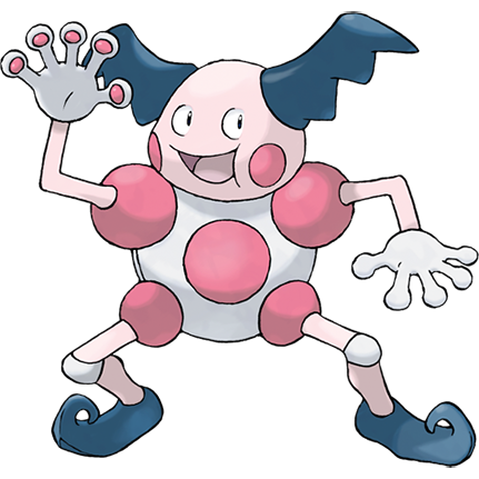
For as long as Pokemon has existed, I'm certain Mr.Mime has been the first generation's most unpopular design, and I can certainly get why. It's an awkward, doll-like little man with goofy hair and a body like a hunk of plastic, but of course, that's exactly what I like about this psychic weirdo, a sucker-figured pseudo-human able to generate invisible walls. Funky!
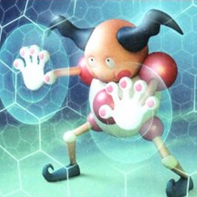
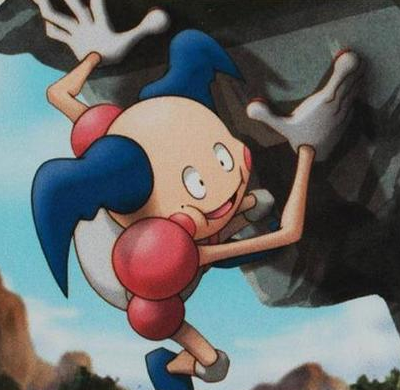
In the hands of a capable enough artist, Mr. Mime can even look pretty striking. On the left we have a mime by Hiroki Asanuma that looks downright creepy in a way I can really get behind, while the one by Kouki Saitou is actually pretty cute. For whatever reason, it's only the mime's most official depictions that are so awkwardly posed and stiffly shaped, almost as if Ken Sugimori never liked having to draw the poor thing.
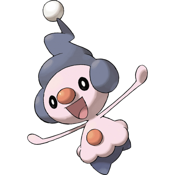
Now, as much as I don't care for baby Pokemon, I have to admit though, you would have to be a pretty die-hard caulrophobe to not find the fourth generation's Mime Jr. positively adorable. It helps that its face is a lot less human-like and more stylized than its evolution, and anything with mostly dark-colored eyes tends to look a little cooler than the alternative.
Trouble is, Mime Jr. looks virtually nothing like what it evolves into. It's not even a mime! What are they trying to imply here? That a mime is just an old clown? We all know that isn't true. Clowns and mimes aren't even the same genus.
I'm willing to defend Mr. Mime from its haters, but I think Mime Jr. should have been the start of a whole new evolutionary line. That said, I originally only gave this line a 3/5, but I've revised it literally years later to a 5/5 because these two are just so unusual, iconic and hilarious.


FIRST PREV ARCHIVE NEXT LATEST
