

The Duskull Family
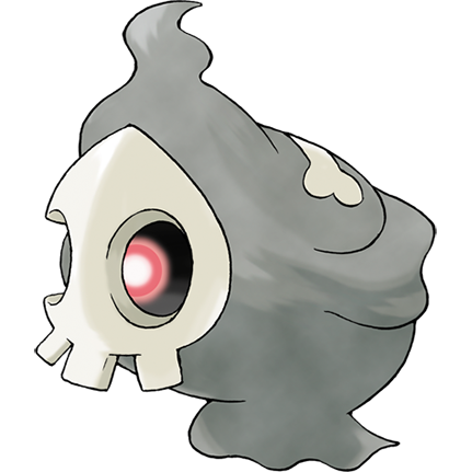
Until we get to the fifth generation, this will be the last pokemon I've already reviewed in depth once before, and I'm sorry to say my opinions haven't changed on this one. Duskull is the perfect ghost type, an adorably stylized skull with a minimalistic reaper-body and a single, luminous eye that rocks back and forth behind its empty sockets. Totally kickass, huggably goofy, unsettling and 100% wonderful.

A design doesn't really get any better than anything with a big, cartoony skull face.
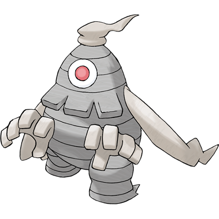
...But then it evolves into Dusclops, and I LIKE Dusclops, honestly, I even used it as a team staple for years. That single penetrating eyeball is totally rad, and I like the grey, blocky, plodding "mummy" look it has going. Its design is actually meant to resemble a paper lantern, which commonly comes to be possessed by a ghost in youkai folklore, but this "lantern" is filled with darkness rather than light; the interior of Dusclops is said to function like a black hole!
That's all really neat-o, but I don't really like the way its teeth were designed, for one thing. The way they just blend in with the surrounding "bandages" and look like three jutting shingles doesn't really do it for me. There's also just the fact that it isn't anything at all like Duskull. We could have had a fully evolved pokemon with a ghostly human skull head and that AWESOME pendulum eye, and they blew it. Dusclops should have been part of some other evolutionary chain, right?

Coolio, but kinda awkward and not a great evolution for the little reaper.
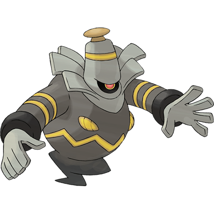
The few failings of Dusclops had one last chance to turn around with the addition of an evolutionary form, but instead, we get Dusknoir, which doesn't look like a spooky skull reaper or a staring lantern-mummy. In fact, I have no idea what this thing is supposed to look like at all. A scary genie? I like the principle of it having a jagged mouth in its belly and a roving eye like one of those scary mobile suits, but the whole thing is so strangely cluttered. It has a cylindrical head with a doorknob on top, jumbled rectangular neck-frills, a scattering of gold bands and a design war going on between its rounded, bulbous elements and sharper angles.
I can respect the uniqueness of Dusknoir, sure, as with many pokemon I really WANT to like and I strongly respect those who do, but it doesn't feel to me like it follows well from either Duskull or Dusclops, and it looks like a jumble of parts that don't look really good together.
I can respect the uniqueness of Dusknoir, sure, as with many pokemon I really WANT to like and I strongly respect those who do, but it doesn't feel to me like it follows well from either Duskull or Dusclops, and it looks like a jumble of parts that don't look really good together.

Oh yeah, and then there's the name, can't forget the name. You just can't say "Dusk-nwarr" comfortably.
