
Tadbulb and Bellibolt
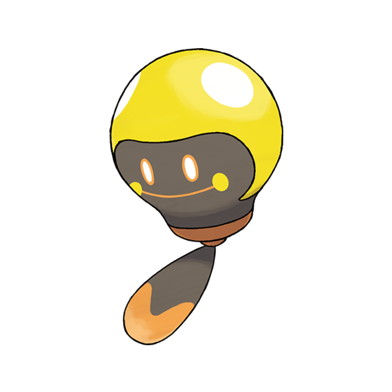
This is a pure electric-type frog line, and I'm just going to come out and say up front that it's visually my least favorite frog line in the Pokemon world. The evolved form was revealed first, and we'll talk more about that, but in the meantime here's a hovering lightbulb with a smiley face. The bulb itself is divided into a yellow upper surface with two bright, white spots of light and a darker brown front so that when viewed from the right angle, it looks like a round yellow tadpole with two white eyes and a darker "underbelly." That would actually be kind of cute, except its true face is the glowing emoji-like smile on the "belly." This ties into the gimmick of the evolved form, but it just doesn't look appealing to me, and I don't like the way the tail is just a paddle loosely attached to the base of the bulb either. Why not make it look wire-like or something?

Tadbulb evolves into Bellibolt with exposure to a Thunder Stone, and this was teased during the game's hype season as a froglike Pokemon with large, false eye-like electrical sacs. This lead to a lot of speculative fan art depicting all sorts of charmingly froggy critters, but when the actual design was revealed the reception was, uh...less than enthused.
Bellibolt is a frog with a pair of false eyeballs and a transparent "plasma ball" stomach, like one of those clear spherical lamps with the glowing energy inside. This is a concept that could look any number of interesting ways, but in Bellibolt's case, it's an awkward green lump in a guitar-pick shape with featureless oval nubs for arms, featureless orange nubs for feet, a big black plasma ball awkwardly sticking out of its stomach, the false white eyes stuck to the sides of its head like earmuffs, and the glowing "true face" pasted between them like a sticker.
Bellibolt has its fans and I'm glad that some people appreciate it, but the design is still just a bunch of clashing, disparate features glued to a plastic wedge, and it only barely looks like a frog. Just a little more body shape and in particular some froggier appendages might have earned it a respectable 3/5 from me, but I'm afraid I can't personally get past its slightly squished triangle design.
I sketched one alternative take, maybe not perfect, but just an example. It's also now been colored by Titleknown!

