
LOST POKEMON:
KOKUMO AND TUHEDD
CONTENT UNCOVERED BY THE CUTTING ROOM FLOOR
Original sugimori style artwork by Rachel Briggs!
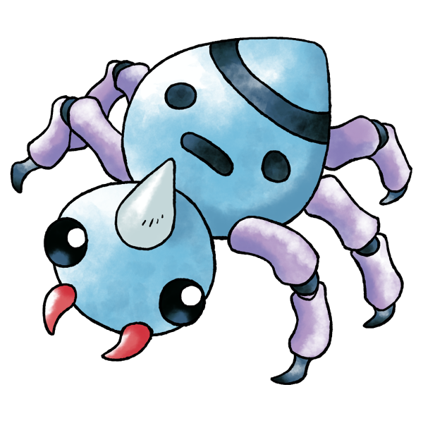
Hey, it's Spinarak! Spinarak looking just a little bit freakier with knobbly, segmented, claw-tipped legs that I definitely prefer to what we got instead, though it's not as big a difference as some of our other pokemon. The name is basically just "kid spider!"

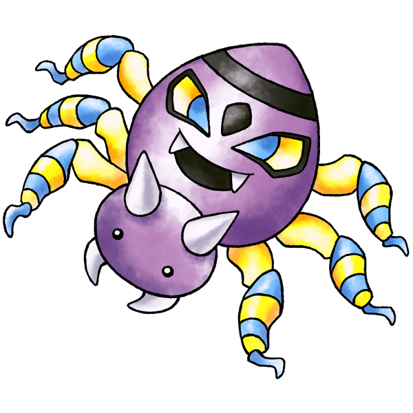
Ariados, on the other hand, was almost COMPLETELY different, really looking more like a bigger, meaner version of its prior stage, and while the final Ariados has a pretty nice design, I wish there'd at least been a middle ground between the two concepts. Tuhedd's demonic mask abdomen follows more directly from the face on Kokumo or "Spinarak's" back, and makes for an overall more distinguished spider monster. Maybe they thought this was too similar to their concept for a ray with a scary face on its back...but then they toned the both of them down.
I'm definitely seeing a pattern here in which a beta design had a more extreme visual gimmick they decided to dilute before release, and it doesn't even make sense from a marketing perspective.
I'm definitely seeing a pattern here in which a beta design had a more extreme visual gimmick they decided to dilute before release, and it doesn't even make sense from a marketing perspective.

