LOST POKEMON, ROUND II:
BETA DUNSPARCE!
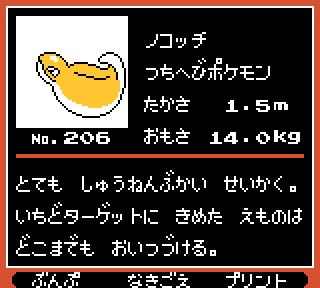
Maaaan. I like Dunsparce, I respect it, I love the heck out of its sleepy, satisfied little face, but the rest of its body always kind of left something to be desired, to be honest. I never cared much for the awkward drill on its tail, and this simpler, fatter body would have solved everything. I LOVE this roly-poly tsuchinoko!

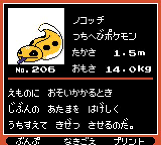
I'm not certain which one actually came first, but this appears slightly closer to the final Dunsparce while also a little more "menacing," and I think in this case, I like it entirely better than Dunsparce, because those grumpy eyes better capture the personality of real reptiles and the blue tongue really makes it seem like they were going for a fat skink!

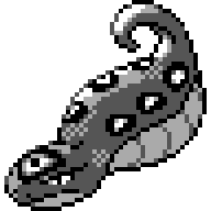
Then, finally, we have this more "realistic" fat-bodied snake, and it's pretty cool I guess, but this one isn't nearly as fun or iconic as any other design that this Pokemon went through. Acceptable, but admittedly a bit too plain.

So, having seen all these Noko's, I have to say my final thoughts on Dunsparce are that it still wasn't done. The various designs they tried out all had their merits, but the final version came out a little stiff, a little cluttered.
In my humble opinion, a superior 'sparce would have combined bits and pieces throughout its development, and maybe come out looking a little bit like this:
