Written by Jonathan Wojcik
Ghostbusters 2016: Unused Ghosts
Analyzing the ghosts of this movie was something I originally meant to do the same year I put up my own
review of all three films up to that point, but at the time, I didn't really find enough to discuss about its "creature" designs, or lack thereof, even as much as I kinda liked the rest of it. In the years since, quite a bit more has come out about its
scrapped designs, but it's also felt...kind of gloomy to talk about this movie at all. I didn't dislike it, but there was so very much that it could have done better, terrible people attached a lot of terrible opinions to it, most of the people involved with it were harassed relentlessly on social media and it ultimately faded away as uneventfully as its knee-jerking haters were rooting for. From start to finish, a situation that never needed to and shouldn't have been so ugly and unpleasant, and I wish I could have said it opened my eyes to how revolting fandom culture has come to be, but, that had pretty much already happened
long before.
But aside from all that, there's a single aspect of the movie itself that even I was pretty unhappy with, which I only lightly touched on in my original review, and that is, unfortunately, the part that you know I was the most excited for when it was first announced.
The original two films featured a wide variety of memorable monsters. Even its most human looking spirits were usually caricatured, ghoulish puppet-creatures with exaggerated proportions, making each a fun and memorable on-screen presence with a design you could never confuse for just any generic Haunted Mansion filler.
Conversely, nearly every ghost in the 2016 film is literally nothing but a translucent, luminous dead person. Exceptions include a fairly conventional draconic demon, some inanimate objects possessed by what are assumed to be more human ghosts, the main villain's transformation into a facsimile of the Ghostbusters logo and of course Slimer because they couldn't really have gotten away with leaving Slimer behind, but otherwise we just see hordes and hordes of...glowy people. The same basic ghosts you can see in the most low-budget, made-for-television knockoff Halloween specials.
And the worst part is...
it wasn't GOING to be that way. Most of the following designs were by the
artist Tully Summers, who released them on his own portfolio about a year or so after the movie came and went...
First, there's this
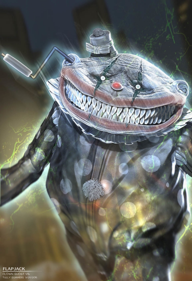
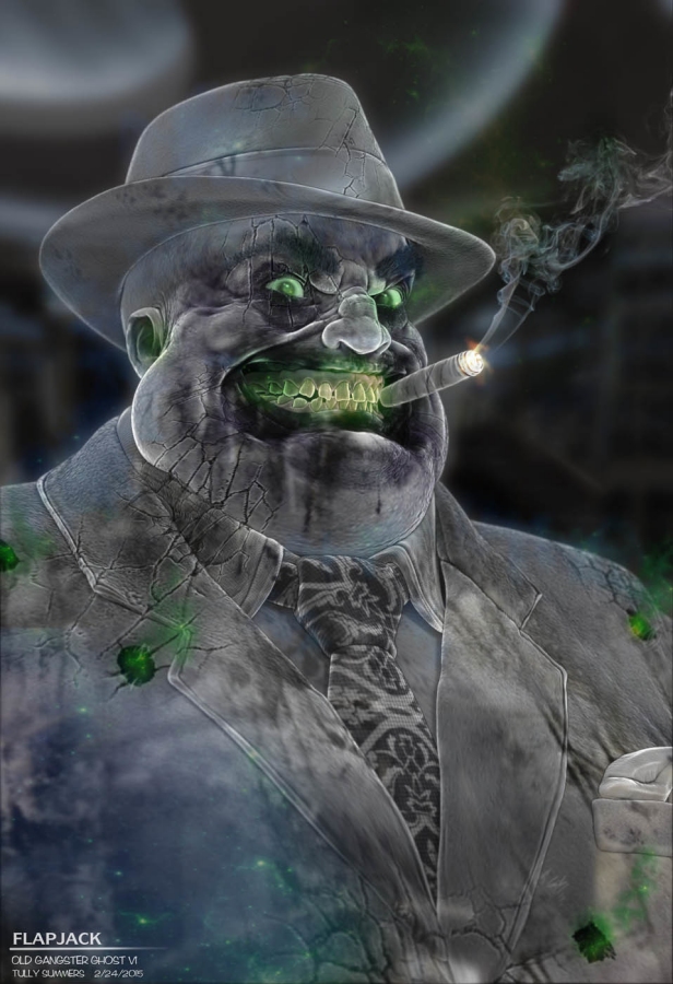
horrible clown ghost, and I mean that in the most loving way. You can immediately see the influence of the ghosts from the original two films, cartoon and toy line, clearly the spirit of a human, sure, but warped and twisted into a monstrous form. It's worth pointing out that this is also the case when you look at older artwork of ghosts from almost any culture in the world; rarely were they assumed to look exactly as they did in life. Even in relatively recent, American ghost stories they might have been described with big saucer eyes or sharp teeth or long, bony fingers, and it's really only Hollywood that decided otherwise at some point.
You'll also notice that the clown has a handle sticking out of its head.

The second head is a tad cheesier, but the ghost was basically going to function like a Jack-in-the-Box, which is just ingenious! That inner clown is like some kind of parasitic worm or something. Could this have been the ghost of a single person who had a duality going on, like an actual clown who was secretly evil, or is it possibly two people who became one in death? A clown duo who died together? Whatever it was supposed to be, I don't think audiences would have forgotten this imagery any time soon.
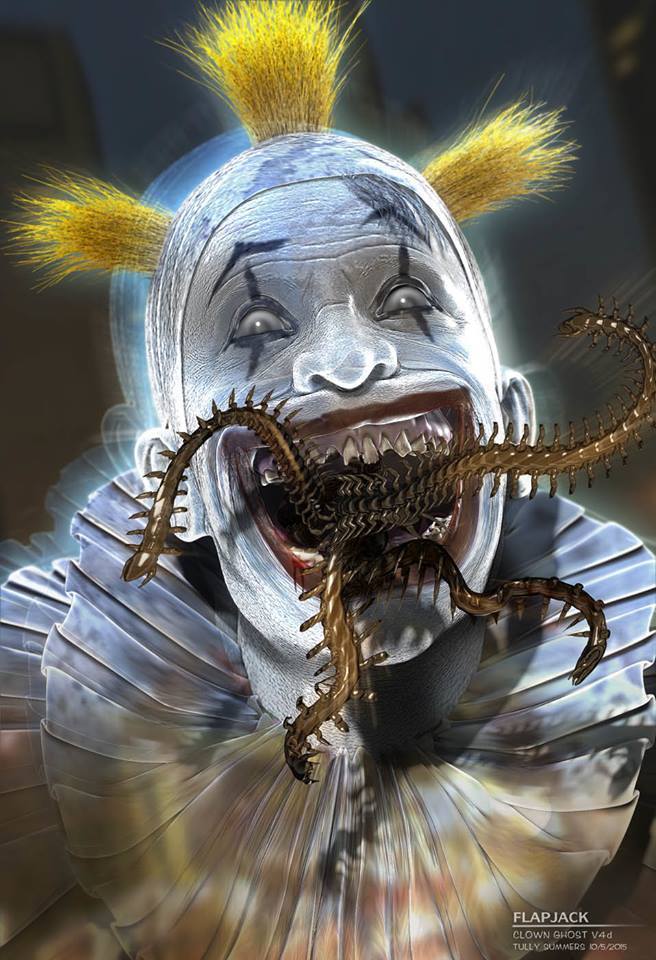
But it was not to be. The studio saw that phenomenal clown-within-a-clown, and they wanted
less. "You tone down that clown in a clown or we'll frown," I imagine they said. The next draft was a perfectly normal looking clown, but Summers suggested it at
least have a mouthful of centipedes. Apparently even that was too much for them, and for unrelated reasons, the clown scene was scrapped anyway.
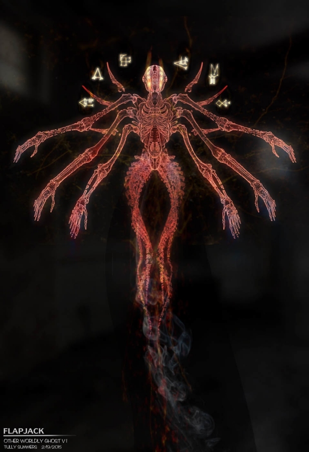
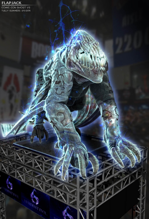
In another scrapped, much more extravagant plot point, the villain of the movie would have been drawing spirits to our world from many different realities, resulting in what were literally
alien ghosts cropping up from distant dimensions. We've all seen interdimensional spirits and cosmic horrors, yes, but rarely have I seen any setting in which we've just got the literal ghosts of dead non-human races. With is floating spike wings, dual spinal columns, split face and floating runes, this is another one I can admit is pure badass even if it lacks the fun and whimsy of some other designs.
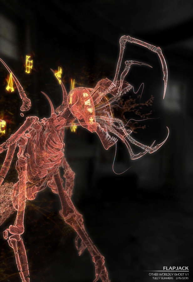
...Especially when that split face would have opened up even more, to reveal insectoid appendages and a quartet of toothy jaws! The way the glowing runes evoke eyes from this angle looks especially killer.
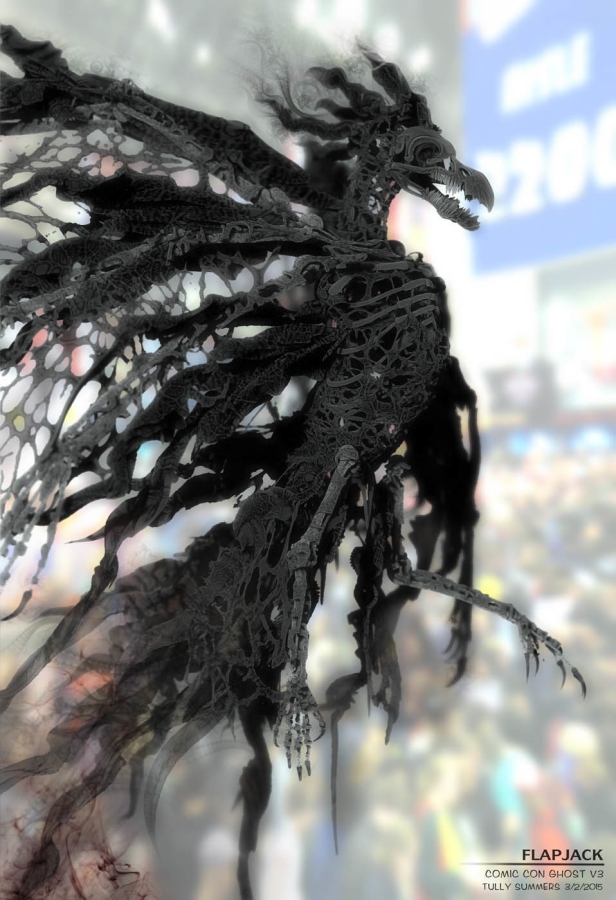
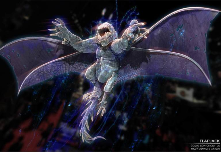
The "alien ghost" would, as per my understanding, be replaced later in the script by a "demon" that was to attack the San Diego Comic Con, and this was one of its earliest drafts. It's no "alien ghost," but still an absolutely
magnificent design. Look at this thing! Who wouldn't have fallen in love with this vaporous, tattered bone-raven?! It doesn't quite have that Ghostbusters feel to it, but it's goth as hell and undeniably radical.
The studio, however, did not like the shadow-bird, and asked for a "demon" instead. Summers tried to give them something that would still be a bit weird by giving it "mouth fingers," which would have certainly been a nice little bit of flair. Once again, the studio said no. Apparently even that was TOO weird.
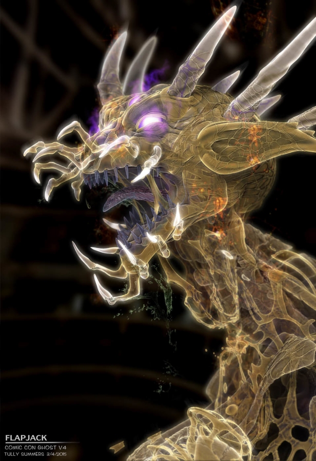
Summers' next shot at the comic con demon was a beautifully pugnacious beast whose face was 70% long, chattering, crooked teeth, which I think would have been more memorable and interesting than that previous design but still not as outstanding as the bird. This time, apparently, the studio was as blunt as asking for "a
classical demon," which became the bat-winged, fiery thing we see at the rock concert in the final version. The conservative attitude here is just saddening, as if the higher-ups honestly hadn't noticed or cared about how unique the designs got in the original movies, or worse, they noticed and cared and
decided they didn't like them.
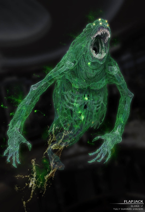
There is ultimately only one final decision I can agree with here, and that is the decision to keep the original Slimer. At first, the studio apparently wanted a "scarier" Slimer, which is entirely beside the point of the character, and I think would have definitely only annoyed even those of us who were otherwise on this movie's side. Whether they had gone with original or grimdark Slimer however, what's more eye-opening is that the director originally wanted Slimer's design to have a "justification"...
In an early draft of the script, Slimer was originally a human-like gangster ghost, but would be the subject of the Ghostbusters testing out their busting equipment for the first time. The proton rays would have apparently "burned off" some of his body parts, then turned him green as they tried to recalibrate their tech, then just partially destabilized him into the "slimier" form. All of this just further hammers home what we've already seen here: that for whatever reason, the people in charge simply didn't understand why a ghost wouldn't look perfectly human, and thought viewers would be similarly confused if they didn't get a simple, straightforward "explanation" for it.
You know, like that scene in the original Ghostbusters where Egon grinds the narrative to a halt to explain the evolutionary history of Subway Specters for an additional six-hour lecture. Thank god he did so people didn't get too angry and walk out.
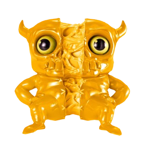
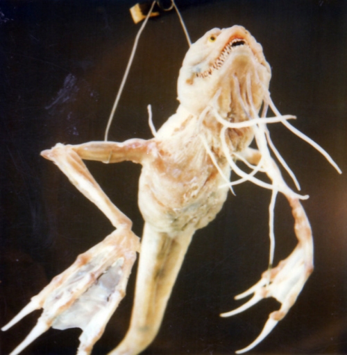
Last but not least, I want to take a moment to talk about a design that WAS sort of officialized, yet did not appear in the movie at all. The mysterious "split ghost" appeared only in the toy line, but as both a tiny-size plastic figure and a larger, soft rubber squeezy toy, seen here as a prototype with eyeballs that were later removed in favor of empty sockets. Nobody is certain where exactly this design comes from, but it appears that it would have been a devilish ghoul with a head almost like a bovine skull and an ability to split apart down the middle. Maybe this was a concept Summers didn't share, maybe because it wasn't one of his own, but for one reason or another it made its way into the merchandising without ever appearing on-screen, and I think we can guess why.
Everyone who worked on and performed in
Ghostbusters: Answer the Call as it is actually entitled had pretty high hopes for this movie, most of them gave it their all and their hearts were in the right place. Unfortunately, as is so often the case, the execs with all the real money suffered a severe lack of wonderment for original and different ideas. Every decision they made here was a vapidly conservative one, neutering every attempt to inject a level of aesthetic creativity that would have been anywhere near equivalent to the bar actually set by basically every single other Ghostbusters media ever made. Whether this kind of thinking similarly stifled other aspects of the final product isn't totally clear, but I feel like it's strongly inferred.
Even if you hated this movie, I think the progression of its ghost designs alone should give you a window into how sincere of an effort it was
supposed to be. It's been years, and I still feel it was a better movie than anybody gave it credit for, but there are many obvious ways it could have been better than that still, and the fact that the performers behind the new busting team - who could not possibly have had any less to do with a single creative decision that went into the project - suffered nearly all of the ensuing backlash is still an infuriating, disgusting thing that a lot of people should honestly still have to answer for. I didn't mean to turn this post into something so sad or one of my most all-time negative posts since some of my
Silent Hill reviews, but I guess I just had to finally get all that stuff off my chest, and I hope the three whole years that have gone by were enough time that renegade fan mobs won't care enough to troll the comments here.
MORE HALLOWEEN FEATURES:
WAYS YOU CAN SUPPORT THIS SITE!