Reviewing Resident Evil 2 Remake Creatures
Back in 2018's Halloween season, I meticulously reviewed almost every single monster from the entire Resident Evil franchise, but never got around to reviewing designs from the Resident Evil 2 remake that would debut the following year. In part, that's because the number of monsters actually went down, and of the surviving creatures, one redesign was a pretty big disappointment...however, with two remake games out now, I've no excuse to put this off any longer.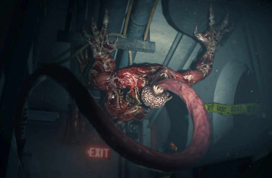
LICKER
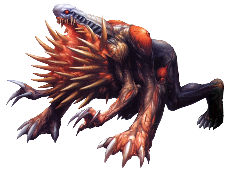
First up are the Resident Evil II critters, and you can go ahead and revisit my original monster review for comparison. We won't retread creatures as simple as the dogs, roaches and alligators or anything that didn't change in any way, but we will include the Licker here. It looks great at this resolution, but I somewhat miss the huge, long talons in place of actual fingers, and I don't think it was necessary to actually put visible barbs on the end of the tongue. The way their tongue was capable of stabbing and slicing with no obviously sharp elements was always a lot creepier in my book, implying some sort of microscopically fine edge.

PALE HEAD
This is a brand new enemy to the lore of Resident Evil 2, an alternate zombie strain that's not only faster and stronger but can rapidly regenerate. It's definitely much more frightening looking than most zombies with its blind, bulbous face and pasty, fatty looking flesh.

G-MUTANT
One of my favorites from the original game has been expanded a little; I always loved the pitiful, "rejected" G-mutant for its putrid, globster-like design and miserable expression, so it's all the more ghastly, all the more pitiful now that you encounter several of them lying around in the sewer like big heaps of meat until prey gets too close. I also like that their faces now split open, and there's actually a huge worm-like proboscis in there, but I'm not as big a fan of their now tiny, beady eyes. The sadder, more human eyes of the original design would really look even better on this version.

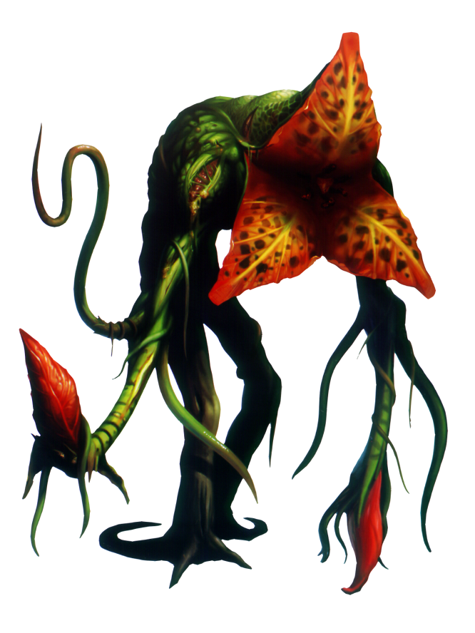
IVY
So...this is the big disappointment I was talking about. The classic Ivy is one of my top favorite designs in the franchise, and I would have thought it was considered one of the most iconic among other players as well. Let's look at it again:
WILLIAM BIRKIN'S FORMS
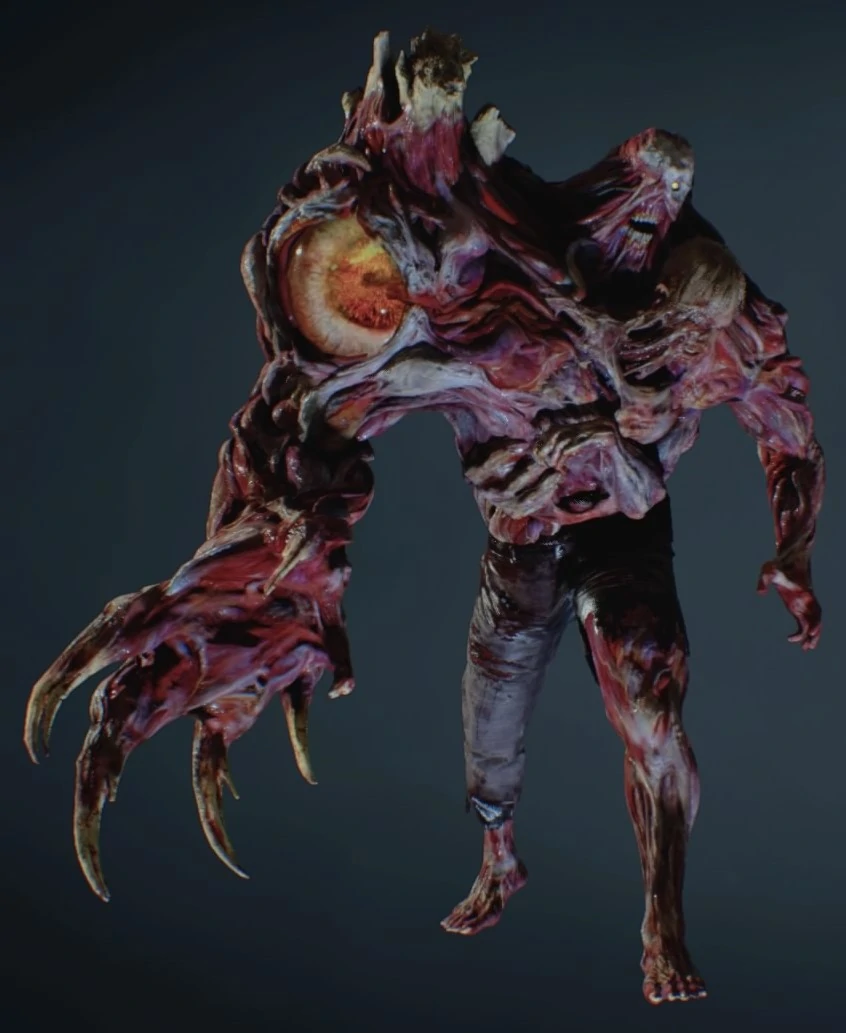
Birkin is kind of another mixed bag. His classic design is mostly intact here, and the huge eyeball is more striking than usual. I liked the slimy redness it once had, but its more life-like appearance here kind of drives homw that this guy's so screwed up, his shoulder wants to be his new face.
Sadly, this not only wraps it up for the remake's noteworthy designs, but at least a few of its monsters - notably the giant spiders and moth - are entirely absent, with the designers saying they found them too "unrealistic."
Unrealistic? In a game where a "virus" can transform people into skinless brain monsters? Come on. Resident Evil wasn't supposed to be a series about dingey, grey and brown realism. It was a series in which a pharmaceutical company brings B-movies to life for cash and hides them behind puzzles.
MORE HALLOWEEN FEATURES:
