THE UGLY STICKERS
Written by By Jonathan Wojcik
All scans courtesy David Paul of Bubble Gum Cards!
The last set of distinct Ugly Stickers characters to review are those created as "make your own name" stickers, with blank labels kids could fill out themselves. It sounds like it would have detracted from the thrill of hunting down just the right names, but I guess you needed something like this for those kids with the really weird names, like mine, apparently - there isn't any official "Jonathan" Ugly!
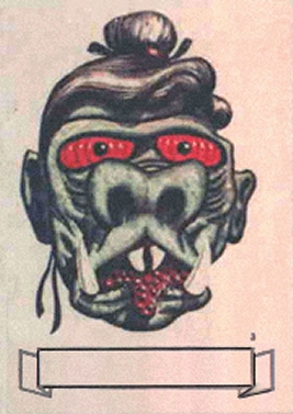
This is possibly my least favorite Ugly, having no distinguishing gimmick other than stereotyping China. I guess the very bumpy tongue is unique.
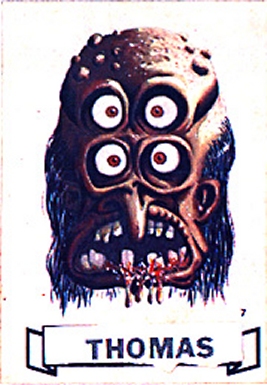
This four-eyed ogre is especially menacing with its gore-stained teeth, one of the few Uglies with an explicitly violent streak. The way those eyes stare blankly from the perfectly round, oversized sockets is a fairly unnerving effect.
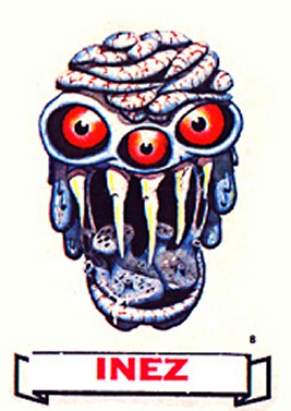
Another one with irregular, stalactite-like fangs and a very alien appearance, its head made up of tangled, fleshy knots. I can't quite tell if everything below the teeth is the inside of a gaping mouth or a very bizarre chin.
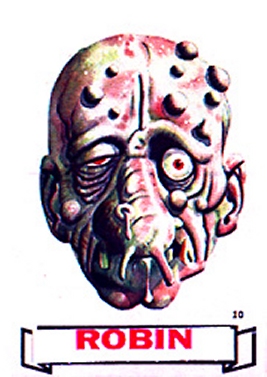
Another sad and pitiful-looking humanoid, this one with some nasty looking pappila growing out of its face.
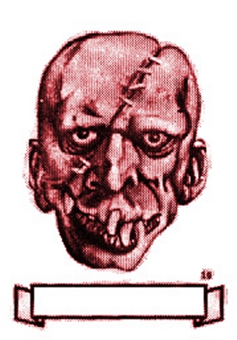
I'm not sure why this one is almost colorless, but it's essentially a very toothy Frankenstein's monster and rather pales in comparison to other designs.
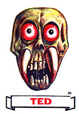
This bug-eyed, tusked skull guy, on the other hand, is another one I find rather cool in spite of its simplicity. It's also another one that appears to have feasted recently. If those are blood-sucking fangs they must be pretty painful.
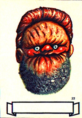
This is another sucked-in face that would be humorous if it didn't look so lifelike and decrepit. The tiny little eyeballs are pretty funny, as is the mighty neckbeard. This is more or less what I always saw in my head when reading youtube comments. I'm positive this Ugly loves video games. Even before they were invented, he already knew.
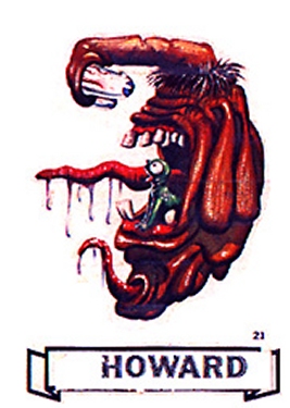
Getting back into the weird and wacky, this flabby, saggy whatsit looks either frightened or angered by the sight of its own face through its single eye-tipped arm, whereas the adorable little monster living in its throat seems nothing but delighted by this whole situation. Look at that little guy! Don't you want one!?
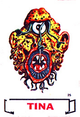
Our very last Ugly to review is a nice mix of the menacing and preposterous qualities throughout the series, with an almost sponge-like surface, lovely lamprey-like sucker and several strange hose-like tendrils emerging from its eye socket. It looks like something that would be on Lost in Space if their production values were a little better.
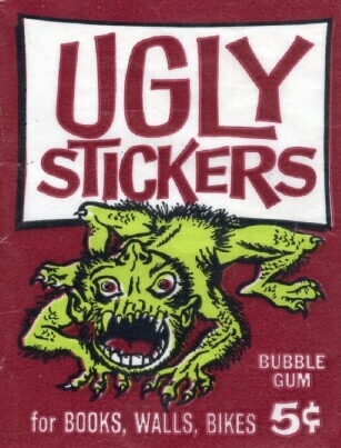
If you've read these in order, you likely picked up on a slight style shift between the first and second Ugly generations. On their own merits, the second wave is an exceptionally cool and interesting gallery of goblins, but many of them lack the humor and outrageosly alien anatomy of their predecessors. The first series, from beginning to end, is a masterpiece of the monstrous. I wouldn't change a single hair on a single one of their head-like-protruberances. It's downright criminal that the Uglies aren't more widely known in today's cultural environment, as I'm sure they would inspire many artists to cut loose and go crazy when conceiving their own original monsters. Even having drawn hundreds, perhaps thousands of monsters in my own lifetime, I feel like I still have a lot to learn from the sheer freedom demonstrated by Norman and Basil's Ugly Sticker concepts. Every time I see them, I feel more inspired than ever, and hopefully, they might inspire some of you as well.


